Nette Mashewske, 2021
Final Project, Emotional Data

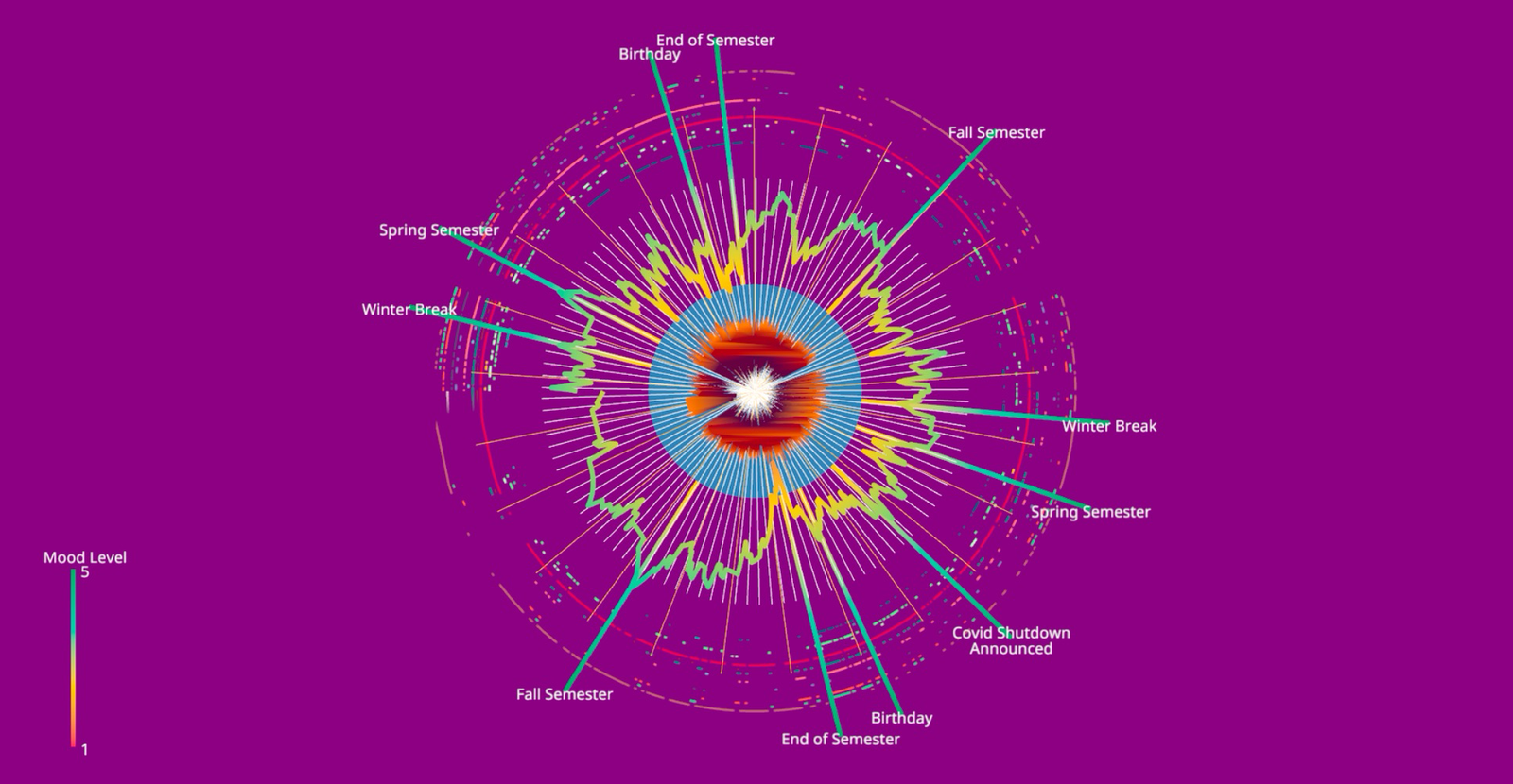
For this project, I wanted to create a representation of the emotional data I’ve collected over the past couple of years. While my logging has fallen off in recent months, the data I’ve collected has given me the opportunity to look back over the last couple years and all the events that have occurred during them. The multi-color line represents my mood quality as an exponentially weighted average, with quality described by radial distance and color. Alongside this radial line chart are several intersecting lines. These lines not only mark key events over the data collection period, but they also act as a scale, with their colors matching the colors of the line chart at a given radial distance. In addition, there are white and gold bars along the line chart which represent the start of each week and the start of each month respectively. The brown shape in the center represents an exponentially weighted average of the logarithm of the number of words written in my notes for that day. The shape is thicker in areas with greater amounts of words, and is blank in areas without words. The logarithm was taken as there was a segment of data with a word count in a notably larger magnitude than the rest of the data, which made scaling to a reasonable extent infeasible without taking the log. Outside of the line chart there are several discontinuous circles representing my recorded emotions. Each circle has its own color, and represents a different emotion. The areas where the circles are not present are areas where the emotion was not recorded. In order to maintain my privacy, the emotions are not labelled.
The primary feature that I wanted to emphasize was my mood quality over time. I initially created a linear line chart with vertical bars to represent key moments in time. However, upon adding an additional line chart for the word counts, I felt that the use of space wasn’t very cohesive. After thinking on how to fix this, I noticed how most of the scale for the line chart was going unused, and I realized that if I made the chart into a radial form I could place the word count data within the unused center. When I then considered how I could best represent my labelled emotions, I noticed the additional space left outside the line chart and came up with the idea of representing them as concentric circles, as I could represent each emotion for each day while also easily portraying the combinations of different emotions present.